
“I love the color orange, and I’m in the beauty industry, so I need the R in my business name to look like a blowdryer, and I want a hairbrush in there too so that when people see my logo they just GET IT, y’know???”
Back it up, friend! Your logo is not supposed to tell people what you do. That’s what your brand messaging and marketing are for! And you’ve got a whole Instagram page and website to show off your skills, so stop trying to fit your life story into your logo!
Your logo should be:
• Easy to read in various sizes and on all background colors
• On-brand, and convey your business vibe and essence
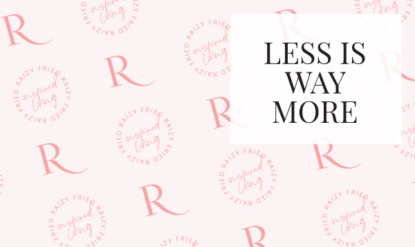
So…where do all the cute icons go?
If you love iconography and cute little drawings, I highly recommend going all out in illustrations and graphics in your brand pattern! I love designing those, and there are so many fun uses for a brand pattern. It gives you other opportunities to use visual branding rather than just repeatedly using your logo everywhere. You can use these elements in your website design too.
Your main logo can have a single icon representing it––something unique that is recognized as yours when people see it.
You can see brands come to life in my portfolio here!